Thursday 31 March 2011

Digipak cover Idea

Using the intertextuality ideas I had earlier, I have a clear idea as to which image I want to use as my advert and Digipak cover. This is the shot of the protagonist leaning against the railings i the park. This gives it an urban, british sound feel and in my opinion looks good. Also, as it is commonly used in the video, there is a link established and the band have an image created. Using Microsoft Publisher, I have created two possible Digipak covers. I created them both by changing the contrast and brightness which is very quick and easy to do on this program. The image is the same, however in each cover, i change the emphasis of the wording. On the first the name of the song is in bolder, bigger lettering, on the other hand, number two is complete contrast to this. I personally prefer number one, purely because I think it looks neater and highlights the song, which afterall, is what the CD is dedicating itself to and its main selling point is.

Friday 25 March 2011

Digipak planning

These are a series of images from my music video that I think will look good. They are representative of the narrative and the different stages the narrative goes through. The black and white images represent a certain part of the narrative and are a good contrast to the full colour other pictures. I will sort these images out by changing brightness and contrast to make them more appealing.


Sunday 20 March 2011

Digipak analysis - Franz Ferdinand

As part of the research into my Digipak, I have decided to look at an indie bands digipak. For this I have chosen Franz Ferdiand, a well established English band. Their Image is quite well respected and known now. Especially the font and style of the way their band name is written, as a logo. This is evident in the front cover.

The plain black background makes the white lettering stand out far better. The font is very well established by the group and has become almost like their signature. The band only needs their name on the front because they know that this is a major selling point. People know who they are, respect their music and will want to hear it based on what the group have produced before, musically. Unfortunately, I will be unable to do this with my band as they are unsigned and unknown so will probably have to use the song title on the front more.

Inside the digipak, the band has listed the words to their song so that it involves the audience. The reader can feel a part of the band, singing along to the lyrics and being able to interpret them better. This is something that I may look to use in my own digipak, so that people can understand the lyrics and basis of the song easier.


In the middle of the digipak are pictures of the band. This is the most striking element of the digipak in my opinion because it is representation of the band. They are being represented as a fun, slightly random group of people. This is quite stereotypical of an indie band. Again, the band is able to do this based on their image being a very strong and mainstream one. This will be less effective for an unsigned band.


On the back of the digipak is an exact replica of the front. This acts as a sort of book end to the lyrics and pictures in the middle. It also continues the band image and literal written name style.

Last is the disk. This is very decorative, which is slightly unconventional of a musical CD. The band are pictured for the first time in a performance position. Also, the song list is placed in the same font as the written band name, which is informational

Monday 14 March 2011

The Beatles - Digipak


The first digipak i looked at was an old Beatles one.


The Beatles were famous for producing iconic music and imagery for their releases. In this one they use the front cover (pictured above) to show the band because they are able to use their image to sell music. The image is of the band with a 60s sort of image filter which of course reflects the time it was taken. The old style font used also backs up the generation that it was released. After the image of the band is used, the iconic Apple logo is another thing that promotes the brand image of The Beatles. This is the logo for the record company formed by the band themselves. The plain blue colour scheme keeps it simplistic and also makes you focus purely on the things that give information about the album; The band, name, dates and logo.


The next two images are also very important. Inside we have a whole panel dedicated to the apple logo, so famously linked to the band. Next to it is the contrasting image of the band in their younger days, in the exact same location. This contrast is striking because of the very subtle change between the image.


The inside part has a detailed history of the band, another image, this time black and white of a crowd, which is something i may use for mine. Another part that i may use for my release is of the lyrics being written out. I believe this will help you connect with the audience so that they can experience the song for themselves (by singing along)

Finally, the back of the digipak shows a list of the songs that appear on the release. Again the band name is in the 60's style font, whilst the songs list is in a simple font. The website is advertised at the bottom, which is something i may look to do for my own. There is a bar code and other legal functions that i will need to make sure i add in to my own digipak myself.


Sunday 13 March 2011

Digipak - What is one?

A digipak is a style of CD (compact disk) packaging. The main type, and the one i will be choosing consists of a six page booklet, that accompanies the release and sale of an album/single. it is important to produce a good one because it has on it:
  • Front cover - This is the main selling point of the album. Has the tittle and band name, usually with a picture of the band or maybe a specially produced picture that is to do with the release (front page)
  • A contents page - This is of all the songs on the CD and what order they are on (usually back page)
  • The other content can vary from what ideology the band has. Can range from lyrics to the songs to just pictures that relate to songs on the CD
In the next few posts i am going to explore some of the different Digipak releases, showing different styles and what i can take from these. I will eventually plan my own and then create it to go with my Music Video/song.

Thursday 10 March 2011

Differences with the animatic

Not too many differences to my original plans which shows how strong the original ideas were in my opinion. I have added to the original plans with far more different camera angles which keep up to pace with the quick beats of the song. The varying range of camera angles also makes it look more like a television proggramme or film, which is what I wanted to create.

At the start I changed the driving scene because I fet there was no need to show the lads actually pulling up to the house, getting out of the car etc etc, It was uicker and easier to just move it to the bedroom/drinking, without effecting the narrative in the process

Tuesday 8 March 2011

Final Cut Video


This is my final cut video.

I am very pleased with what has come out of it after some troublesome filming time. I have really loved the editing process, however, found the filming and organisation of people very difficult and time-consuming.

My initial reaction to the video as a whole is:

Positive:
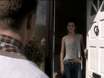
The range of close ups/mid shots/high angle shots are very good and give the video a more unique feel. Also, the first person drunken shot creates a feeling of being in the video and a part of the protagonist's thoughts.

I also feel that the narrative works because we, as the audience, go through the emotions with the main character, which is hugely important. I also believe that the shots meet the music well, because when there is a lull, the protagonist emotions are low as well reflecting this change in musical pace.

My favourite or most successful scene is probably the clip of the pint of beer going down in stages, and shows more clearly that a lot of drink is being drunk, in a very short space of time. As well as this, I think the final shot of the character happy is very effective as it highlights the huge upturn in his emotions from when he was drunk and depressed, hammering home my overall message to the audience.

Negative:
Some of the clips in the narrative, especially at the start are very short and don't really get noticed too much by the audience. This looks messy and also takes away from each clips important role to the narrative.

Also, the lip syncing isn't 100 percent and the actors emotions aren't always definable. This is my fault as I didn't let the actors know exactly how I wanted them to look or act.

Friday 4 March 2011

New filming schedule

Having had feedback from my audience, I am ready to do the second stage of filming.


I have had problems casting a female character as I was let down on a few occasions, however now I have found one. Filming will be done this weekend and with the following shots:


1) Shot of the three males entering the house - Mid shot
2) Shots of the group falling out with each other/fighting - closeups/mid shots
3) Shots of the main protagonist very drunk on a bed - high angle
4) The main protagonist throwing up - low angle and mid shot
5) Protagonist getting changed - Closeups and mid shots
6) Protagonist walking to girlfriends house and knocking on door - mid shots/ close ups
7) Protagonist making up with Girlfriend and walking hand-in-hand - low angle and mid shots
8) Protagonist making up with friends - mid shot

Once these have been established I believe I should have a fully done narrative and music video

Thursday 3 March 2011

Female Character Cast

I am finally been able to cast a girl to be in the two scenes I need one in:


Name: Kim Thorpe
Age: 18
She is the same age as everyone else in it which helps for realism and she is reliable


Now I can finally finnish the filming and get editing as soon as possible

Wednesday 2 March 2011

Audience Feedback

I decided to show my video to a select group of people in my media class. They are currently working on their own projects, which means they have good knowledge of whats conventional and what looks right. Also, importantly, they are of the exact demographic of which my video is aimed at -17/18 year olds.

I showed the video as a group showing to 10 (5 male/5 female) and asked them each individually for some feedback. (Note: A few others were watching, however they only voiced their opinion. They also wern't all part of my target audience, so i felt this wouldn't be fair to bring their opinion into my conclusions and wern't part of the written feedback)

The comments I received were fairly positive as to how the video was coming along, however people felt "The narrative is slightly difficult to follow because of the big gaps in footage" however they assured me that it should come together when fully filmed.

"The types of shots are good, very different and the narrative structure to it makes it more interesting and entertaining" This is good as I definately wanted the video to have its own personality and unique narrative/meaning. The only way I can really get across my message is by entertaining and keeping the audience focused on the music video and music.

As a side note, the song itself was described as "catchy" and "really good" which is also important for keeping the audience interested in the video.

Now i know that I need to crack on and get this last bit of filming done so that it can be judged as a complete narrative video and I can get more realistic feedback. I will be writing a new filming schedule soon.

Tuesday 1 March 2011

Rough Cut


I am faily pleased with the transitional effects that I found on IMovie. This has really taken my imagination, as I have been able to create the narrative far more realisitcally and create the sence of drunkeness far clearer then I imagined. The missed out shots had to be filled with little tags saying what was to be here as the audience wouldn't understnd the narrative at all, which wouldn't give me effective, reliable feedback.

Now I will show this to people who fit my target demographic and see what they think of the music video in its rough/unfinnished position. I am mainly looking forward to whether they like the quirky sped up/black and white shots.