Wednesday, 11 May 2011

Evaluation written

2) How effective is the combination of your main product and ancillary text?
In my main product I wanted to create a storytelling narrative that would have a message held within that would also be relevant to its audience. My target demographic, sutible to genre, was teenagers just moving into adult life and experiencing new things. This concept I took on would target these issues of relationships and alcohol and try and mak
e them identifiable for the audience I was aiming the pro
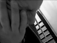
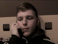
duct at. The narrative aspect was done effectively be the use of many close upsto show emotion of the protagonist.
As part of the narrative I wanted to form it i
n the way of a conventional story, using the film theorist, Todorov's theory of Equilibrium. This included the equilibrium being disrupted (by alcohol) and restored by the protagonist. This gave the narrative an easier to follow structure.


The narrative aspect was used in combination with t
he digipak. The digipak is a sort of linear timeline, with the images chronologically telling the story.

Also, i wanted to create a brand identity, or an image that was constantly re-shown in everything the band produced. This had to fit in with the urban, grass roots sound that the band has taken on. This is becoming a very popular
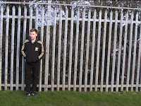
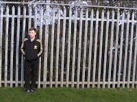
style for pure music lovers, wanting out of the world of computerised, commercial pop that is currently in the charts. The image I selected was of railings you could find anywhere in suburban England,
taking the music and images back to the streets. This was popu
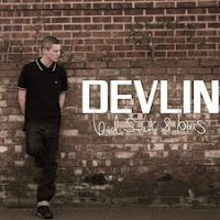
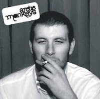
lar in my research as "Devlin" and "Arctic Monkeys" choose images similar in their own projects. This image was also replicated in the advert.


3) What have you learned from your audience feedback?

The audience f
eedback is a piece of informati
on that is imperative and vital for any new product to have. This shows how effective people think your product is, and also, more importantly what they think can be improved. I decided to show my product to the most relevant people as possible, which was my target audience. My project was aimed at 17-21 year olds, so I showed people in my media class. These are all people of the correct age, so i was hoping they would be able to relate to the images I was showing. They also have media experience because they are doing their own project, so they knew what could be changed and were realistic with their suggestions.

The first part I showed people was the r
ough c
ut. This is a viewing half way through the creation of the video, leaving enough time to change whatever they believed did work or didn't. The feedback I got was gen
erally good, especially for the range of shots I had produced and the quality of the editing so far. I found this part a little bit unreliable as much of my narrative was not filmed yet so was hard to follow.
People had a slightly difficult time working out what was actually happening because of the gaps in the narrative. I found that I had to explain most of what I was hoping to create narrative wise, so didn't really get any feedback on how the narrative worked. I was however very pleased that they enjoyed the quality of the camera angles, which is what I really wanted to create in an acting based video.

In the digipak, people felt it was good that I had linked in the narrative video. However, they felt that the images inside were slightly bland.


It was then that I started to add contrast and brightness to tailor the images into being more ascetically pleasing. I was unfortunately unable to act on the suggestions of adding in wording or lyrics to the middle pages because I personally felt it didn't leave enough space for the images to be interpreted correctly by the reader.

4) How did you use new media technologies in the construction and research, planning and evaluation stages?

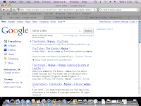
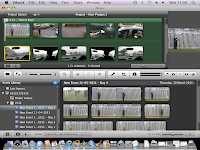
I used many new media technologies when I created my work. I used youtube and the internet extensively to research and gain ideas. IMovie, the feature that I used for editing is very good and easy to use. It has many different features that I used including Speeding up clips, Vignette style and black and white filters. Getting the footage onto IMovie is also very easy, so I was aided by this media technology.

The internet and their search engines helped me achieve all of my research. Also, I was able to gain a font that suited my digipak and advert perfectly via the internet. Youtube proved very helpful also.
Equipment wise, I used a tripod so that the scenes I filmed would be perfectly still. Also, I used a good quality camera that has an easy to access SD card and is easily uploaded to IMovie for the editing process to begin.

As i said before it has many features, and here are some of the features that I found most impressive and were used in my final video. Vignette which allows for a first person, keyhole view, which looked like the person was drunk. Then the speed up shot was used to match the tempo of the music. Finally, Black and white helped me show the changing tone and attitude in the narrative

1) Vignette
2) Speed up feature

3) Black and white filter

The editing screen allows you to link your footage to the music so that it plays over the top as one complete project. Without these media technologies, I would h
ave been unable to do the project whatsoeve
r, so they were the most important component in
my opinion.

Evaluation video

Question 1

Sunday, 8 May 2011

Comparisons with real artists

I have taken great help from artist, which I have tried to show throughout this blog. Here are a few images that show how alike my work is to thiers and are, in my opinion, the main influences and comparisons that you can make to what I created.


I also believe that the sound of the band is very much like the artic Monkeys and also the image I create. I was always trying to create something a little bit like what they have done, which is why I took many camera angles from their video (shown below) as I felt it is the easiest exclusively narrative music video to follow, made by an indie band.

Saturday, 7 May 2011

Brand Identity

As i have commented on throughout the project, I wanted to create a theme of urban, street great brittish sound. This is becoming a more and more popular with the majority of people because of the repelling from the "fake, computerised, commercialised pop" that is currently in the charts. Real music lovers are turning to more natural, pure sounds. This has taken shape in the indie world through the rough guitar recordings and colloquial slus of the lead singers.

Because my band has all of this, I really wanted to play on this and push it to the forefront of my project. From the outset I decieded that I wanted a resounding central image to represent urban life and found it in the form of the park railings:

With this image created I wanted everything else to play around it and access my target audience (17-21) This is where the idea for a relevant message came from, which was alcohol. Through my research I found that this was something that many bands incorporated into their work and was a topic that was very much up for debate. This makes my band relevant and the Great British identity that I have tried to embed onto the band, in my opinion, has been successfully done.

Thursday, 5 May 2011

Audience feedback on Advert

Again I asked 7 boys and 7 girls from my class, who are all in my target demographic. I asked them to list their thoughts on my magazine article in relation to the other things I have produced about the artist.

The overriding feeling was that the advert was a success. They liked the simplistic nature of it and the continuing band image of the lead singer against the railings and felt it was a very strong image. The little reviews also went down well as people felt it was important to have professional opinion and found it very persuasive.

Tuesday, 3 May 2011

My Advert

Here is my final advert. I think it is fairly simplistic and tidy. The image is the same that is used in the digipak and main video which has now become identifiable to the audience. The reference to reviews by major players in the music world also helps, as well as the wording "get" which is an imperative verb ordering people to find out about this band. The release date is also very clear.

The font is graffiti for the song name and band name, but is basic for the rest of it so that the band and song are more recognisable. I used the red colouring to separate the informational bits from the band names and the star rating given by the magazine. This just makes it stand out more. I also wanted to make it clear that this is the debut single, making out that there is a lot more to come from the band and the audience should familiarise themselves with the new sound of the band.

I am overall very pleased with how the magazine has come out.

Wednesday, 27 April 2011

Magazine info


The New Musical Express (better known as the NME) is a popular music magazine in the United Kingdom, published weekly since March 1952. It was the first British paper to include a singles chart, in the 14 November 1952 edition. In the 1970s it became the best-selling British music magazine. It has circulation figures of over 30,000 per 6 months, which may be on the decline, but reflect the whole magazine industry as a whole. It still holds itself at the forefront of musical magazines. It has however got over 1.6 million hits on its internet site, which shows that it still holds great regard in the music world.

As a magazine, it specialises in all things rock, and most recently Indie has become one of the most spoke about genres within it. With the amount of people reading it, it would be the ideal magazine to promote my indie band as my target demographic will be reading the copy. Its important that I make an advert that will be able to stand out when people are flicking through the pages.

Tuesday, 26 April 2011

Advert Planning Stage

To keep the brand identity going, this is going to be the main image of my advert. Also the same font style will be used. I will be putting the band name large as to promote the band more than is done on the digipak.

The features will be the reviews from different musical people, and also the release date and stock retailers will be listed on the advertisment.

Sunday, 24 April 2011

Advert - Wretch 32 urban


I have chosen to analyse an advert by someone who is new to the mainstream scene. Also, this artist is British and part of the new real English sound. This is something that my band has in common. Wretch 32 is a rapper from England.

The main image is of the artist himself, putting him at the forefront, being the main focus of the advert. The writing is in a graffiti style, which looks good, continuing the font style I employed in the digipak. The graffiti gives the advert a "street" feel, which is continued with the drawing of a block of flats, iconic of suburban England. The white and pale blue background act as the sky and atmosphere surrounding the artist and the block of flats. This is the true environment of modern music and is represented especially well in this advert.

The black banner that goes across the advert is informing the public of both the artists name and the album name. This is informative and also eye-catching because of the contrast between the pale sky and the dark banner. All of the other parts inside the banner are informative such as the release date. This is a very important aspect because people need to know when they can get their hands on the album and the date must stick in their head. They are more likely to forget about the album all together if the release date isn't clear.

The final aspect is the places or retailers that the album will be available from. This inks to the release date and involves the audience, as it hints as to making them buy the album for themselves.

Friday, 22 April 2011

Advert Analysis - Manic Street

For preparation into creating the advert, I decided to choose an advert for an indie band. This band is Manic Street Preachers, a well regarded and main stream band in the public eye. I like the simplistic layout, with an image down the right and all the text down the left. It is ordered well and easy to read. Also, the colour scheme is simplistic with the black and white. The main image is striking and links in with the name of the album.

The two most interesting features of the advert are the reviews and the Itunes parts. The reviews are little comments, positively speaking about the artist by some of the leading names in the music world, NME and the times magazine. These reviews are seen as very reliable to people looking at the advert, as they are well esteemed and respected opinions. These are encouraging people to listen to the album.

The Itunes aspect is promoting the new and upcoming medium of listening to music, downloading. This makes it relevant to its audience, as the Internet and downloading off Itunes is fast becoming one of the main ways to listen to music, highlighted by the fact they now have top 10 charts based on downloads.

Wednesday, 20 April 2011

What is an advert?

An adverts primary job is to sell the thing that it is advertising. In music, this means selling a concert or a CD of the artist. This is a very important way of getting people to know who you are and recognise your face. When the advertisement is seen, people generally remember the name, will go home and find the song on the Internet or buy the album.

This is of the up most importance to an artist because, even if they come up with the prefect song, have the perfect voice and the perfect lyrics - it doesn't matter at all if nobody knows about it and nobody listens to it. This is the job of marketing and advertising.

Adverts can be put in Magazines, newspapers, billboards etc and most notably in recent years is the Internet. Now your advertisement and artist can be accessed globally, by anyone around the world, which has given advertising a whole new lease of life and is still paramount to any aspiring artist.

With this I will look to promote my unsigned band as not many people have heard of them and they have relied on word of mouth from some of their small, local gigs. To go with my digipak and video, i need to produce an ascetically pleasing and persuasive advertisement about the CD.

Friday, 15 April 2011

Audience feedback on digipak

I asked the same group of people who looked at my video to tell me what they thought of the digipak. I asked them all to watch the video once more and then look at the digipak to see if they felt it represented the song and video equally well.

There were 14 people (7 girls and 7 boys) that I asked all within the age group of 17-21.

The general feedback I got was very positive. The group especially liked the images and font for the front and back plus the CD. they felt that it suited the style of the video and the song very well. Also, they liked the sizing of the band name and song title as they were noticeable, however not overbearing on the main image.

They did however think that the images inside told the story, but were a little boring. Some commented that i could have added another feature to my digipak by adding lyrics into the middle. While this would interact with the audience well, I didn't think it would be necessary because I wanted the story to be told, and wouldn't have sufficient space for narrative and lyrics.

Wednesday, 6 April 2011

Digipak explanation

The digipak is all based upon the music video. Also, the brand identity is made by the reuse of the image of the protagonist resting against railings. The railings symbolise the "urban" sound to the band, because of the colloquial slur to the lead voice.

In continuation from this, I have picked out the main front image as the image that is shown straight away in the video. The audience can identify with this from the first second in the video. The front cover has the artists name and song title on it. As i said before, I have used a font called "Teen Spirit" which is meant to look like graffiti/spray paint, adding to the urban-street style. I decided that because the band isn't well known enough, this alone wouldn't sell the CD to people. For this reason I made the band name fairly small and the image to fill most of the space. I did however make the song title big so that it would stick in the minds of the audience far better. The idea on this was that the audience could listen to the song and then find out the name of the band, meaning they could search for other songs by the band.

The other images are just snip its from the music video. These images represent different stages of the lyrics/narrative and song. The black and white images are of a real contrast to the bright ones, so that it is apparent there are changes in the mood of the narrative. Also, the pint of beer symbolises the true meaning of the video and the message of sensible drinking it is sending out to the inexperienced 18 year old people that its aimed at.

The back of the digipak is meant to be an eye-catching funny moment, right at the end of the narrative. The whole digipak acts as a brief overview of the music video. This is why the very first and last images that are shown in the video, are the very first and last images of the digipak. This is kind of like a flip book of a story which can be interpreted however the person wants to. The same font style as used to show the name of the band and song, as well as legal things like bar code and year of publish. Another addition is the band website which is informational and interactive with its audience as they can log on and get involved with the band.

The CD is the same image as the front of the digipak, which is fairly conventional in modern times. I have the song title written on in the same graffiti style font as the front of the digipak.

Tuesday, 5 April 2011

Digipak

I have completed my digipak. Here is a visual look at it, the digipak is in order, with the Front cover first, followed by the rest of the pack (in order) and finally the back cover. Also, at the end is the CD design I have selected.


I will explain these all in the next post.

Friday, 1 April 2011

Font - "Teen Spirit"

I was looking for a font that would suit the urban theme, maybe a spray paint or graffiti effect. I felt that this would look most in keeping with the ideas I had earlier. So i typed into the search engine 2d graffiti font and the first website that came up was:


From this image i picked the font named "Teen Spirit" and will add this to my digipak and see the results. If i think it looks good and enhances the cover then I will look to replicate it in the Advertisement as well.

Thursday, 31 March 2011

Digipak cover Idea

Using the intertextuality ideas I had earlier, I have a clear idea as to which image I want to use as my advert and Digipak cover. This is the shot of the protagonist leaning against the railings i the park. This gives it an urban, british sound feel and in my opinion looks good. Also, as it is commonly used in the video, there is a link established and the band have an image created. Using Microsoft Publisher, I have created two possible Digipak covers. I created them both by changing the contrast and brightness which is very quick and easy to do on this program. The image is the same, however in each cover, i change the emphasis of the wording. On the first the name of the song is in bolder, bigger lettering, on the other hand, number two is complete contrast to this. I personally prefer number one, purely because I think it looks neater and highlights the song, which afterall, is what the CD is dedicating itself to and its main selling point is.

Friday, 25 March 2011

Digipak planning

These are a series of images from my music video that I think will look good. They are representative of the narrative and the different stages the narrative goes through. The black and white images represent a certain part of the narrative and are a good contrast to the full colour other pictures. I will sort these images out by changing brightness and contrast to make them more appealing.


Sunday, 20 March 2011

Digipak analysis - Franz Ferdinand

As part of the research into my Digipak, I have decided to look at an indie bands digipak. For this I have chosen Franz Ferdiand, a well established English band. Their Image is quite well respected and known now. Especially the font and style of the way their band name is written, as a logo. This is evident in the front cover.

The plain black background makes the white lettering stand out far better. The font is very well established by the group and has become almost like their signature. The band only needs their name on the front because they know that this is a major selling point. People know who they are, respect their music and will want to hear it based on what the group have produced before, musically. Unfortunately, I will be unable to do this with my band as they are unsigned and unknown so will probably have to use the song title on the front more.

Inside the digipak, the band has listed the words to their song so that it involves the audience. The reader can feel a part of the band, singing along to the lyrics and being able to interpret them better. This is something that I may look to use in my own digipak, so that people can understand the lyrics and basis of the song easier.


In the middle of the digipak are pictures of the band. This is the most striking element of the digipak in my opinion because it is representation of the band. They are being represented as a fun, slightly random group of people. This is quite stereotypical of an indie band. Again, the band is able to do this based on their image being a very strong and mainstream one. This will be less effective for an unsigned band.


On the back of the digipak is an exact replica of the front. This acts as a sort of book end to the lyrics and pictures in the middle. It also continues the band image and literal written name style.

Last is the disk. This is very decorative, which is slightly unconventional of a musical CD. The band are pictured for the first time in a performance position. Also, the song list is placed in the same font as the written band name, which is informational

Monday, 14 March 2011

The Beatles - Digipak


The first digipak i looked at was an old Beatles one.


The Beatles were famous for producing iconic music and imagery for their releases. In this one they use the front cover (pictured above) to show the band because they are able to use their image to sell music. The image is of the band with a 60s sort of image filter which of course reflects the time it was taken. The old style font used also backs up the generation that it was released. After the image of the band is used, the iconic Apple logo is another thing that promotes the brand image of The Beatles. This is the logo for the record company formed by the band themselves. The plain blue colour scheme keeps it simplistic and also makes you focus purely on the things that give information about the album; The band, name, dates and logo.


The next two images are also very important. Inside we have a whole panel dedicated to the apple logo, so famously linked to the band. Next to it is the contrasting image of the band in their younger days, in the exact same location. This contrast is striking because of the very subtle change between the image.


The inside part has a detailed history of the band, another image, this time black and white of a crowd, which is something i may use for mine. Another part that i may use for my release is of the lyrics being written out. I believe this will help you connect with the audience so that they can experience the song for themselves (by singing along)

Finally, the back of the digipak shows a list of the songs that appear on the release. Again the band name is in the 60's style font, whilst the songs list is in a simple font. The website is advertised at the bottom, which is something i may look to do for my own. There is a bar code and other legal functions that i will need to make sure i add in to my own digipak myself.


Sunday, 13 March 2011

Digipak - What is one?

A digipak is a style of CD (compact disk) packaging. The main type, and the one i will be choosing consists of a six page booklet, that accompanies the release and sale of an album/single. it is important to produce a good one because it has on it:
  • Front cover - This is the main selling point of the album. Has the tittle and band name, usually with a picture of the band or maybe a specially produced picture that is to do with the release (front page)
  • A contents page - This is of all the songs on the CD and what order they are on (usually back page)
  • The other content can vary from what ideology the band has. Can range from lyrics to the songs to just pictures that relate to songs on the CD
In the next few posts i am going to explore some of the different Digipak releases, showing different styles and what i can take from these. I will eventually plan my own and then create it to go with my Music Video/song.